You’ve heard the statistic before. The one about how people make up their mind about whether they will come back to a church within a short amount of time after driving onto the property. Cary Niewhof says the reports are that they make this decision within ten minutes. I’ve heard reports that they do it within a minute. Either way, that’s crazy!
It should be something for everyone in leadership positions in churches to consider carefully, however. Because the truth is that your first-time guests, in many cases, are making their decision not on the pastor’s message. Not on the experience of the worship portion. But on the things that happen before a note is played on the stage or someone speaks into a microphone.
First impressions matter!
At the church where I oversaw volunteers and all front-of-house operations, we had a saying, “From the street to the seat.” It was our understanding that from the moment someone drives onto our property, they begin judging what they think of our church. That’s why we thought it was extremely important to, in addition to amazing volunteers smiling and being helpful, offer certain elements to make this transition from outsider to insider as easy and painless as possible.
- Great signage in the parking lot.
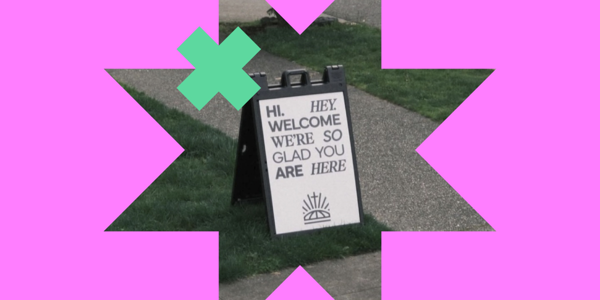
- A-frame street signs by the road with information like service times and our website where passersby could find out more information.
- Flags by the street, showing them where to turn into our parking lot.
- Flags by the entrance, showing them where to enter.
- Sidewalk signs guiding first-time guests, expectant mothers, and the elderly to our reserved parking just for them.
- A canopy tent where your welcome team can gather and greet people as they enter the building.
- Greeting signs for volunteers to hold to welcome people to church.
- Wayfinding signage in the lobby. Have you been in that situation where you don’t know where to go and you don’t know who to ask and you feel all eyes on you judging you for not knowing what to do? I have. And it’s not fun. Clear signage that shows things like: where to check in my kids, where are the restrooms, where is the first-time guest station if I want to find out more, and where do I enter the auditorium if it isn’t already obvious. Don’t be shy with this signage. Spread it all around. Make it very clear where these things are to alleviate the uncomfortable feeling of being an outsider. Utilize signage like:
- Fabric popup displays for backdrops for things like the kids check-in, a welcome station, or coffee area.
- Fabric popup tables for kids check-in or a welcome station.
- Stretch tension displays or retractable banners to identify various kids’ classrooms or to use arrows to point toward areas of interest.
- Stretch tension barriers to block off hallways you don’t want people going down or to corral kids within a space.
- Branded table covers to draw people to a welcome station or coffee area.
And keep in mind that you can convey who you are through the look of this signage, so it can not only be informative, but also help to establish your brand within the space. Reach out today to request a free, no obligation consultation by emailing us at [email protected].
